Book Finder: A Reading Suggestion App
This project was part of a human-computer interaction course at Uppsala University, where I decided to design an app centered on providing personalized reading recommendations that helps users discover books tailored to their reading skill, interests, and personal goals.
Project Goal
Finding the right book isn’t always easy. Different readers face different obstacles when looking for an appropriate book. Some may desire material that challenges them, helping them build vocabulary and engage with new ideas, while others want to be entertained without being overwhelmed. However, the book discovery process rarely considers individual reading skill, resulting in readers choosing books that may be too complex, overly simplistic, or mismatched in tone and content. This can leave readers unmotivated or unable to fully enjoy their reading journey. Therefore, I wanted to explore how this concern could be alleviated.
User Research
Objective
The main objective was to understand how readers with varying skill levels and reading goals discover books, the obstacles they encounter, and the factors that motivate or discourage them from reading. By uncovering the challenges and user needs, this research could lay the foundation for designing an app that provides skill-appropriate book recommendations tailored to reading goals.
Methodology
To capture the comprehensive views of user needs, I conducted semi-structured interviews and a digital ethnography:
- Semi-Structured Interviews: I conducted five semi-structured interviews as my main research method. This method provided in-depth qualitative data and allowed me to understand the nuances of each reader's experience, such as their preferences in book genres and desired complexity levels.
- Digital Ethnography: To supplement the interviews, I conducted a digital ethnographic study, observing discussions on forums such as Reddit’s r/books and r/literature. This approach provided insights into common reading challenges and discovery methods from a broader group of readers.
Given the time and resource constraints, combining interviews with digital ethnography allowed for rich qualitative insights despite the limited sample size of the interviews.
Participants
The research participants included three distinct groups, each representing unique reading needs and challenges:
- Students (ages 20-30): This group included two students balancing academic and recreational reading. They often sought books that aligned with their personal interests, while helping them improve vocabulary and comprehension. They also had goals to explore more challenging topics.
- Mid-Career Professionals (ages 30-50): The group of two Mid-career professionals had limited time for reading, juggling work and family commitments. This group prioritized accessible books that provided relaxation and escapism. Many were motivated by their current mood, often seeking books that were engaging but not overly complex, which would allow them to enjoy reading without feeling overwhelmed
- Retirees (age 60+): The group of one retiree had more time for leisure reading, but faced age-related challenges, such as difficulty concentrating. They preferred accessible content that was intellectually stimulating without requiring intense focus.
Key Findings
Through the interviews and ethnographic observations, several common challenges and motivations emerged:
- Challenges: Many participants mentioned difficulty finding books that matched their reading skill level, often resulting in frustration with overly simplistic or complex language.
- Reading Goals and Preferences: Readers across groups shared a desire for books that aligned with their individual goals. Students often sought intellectually stimulating reads, mid-career professionals preferred books that helped them relax, and retirees leaned toward accessible but engaging content
- Design Implications: These insights highlighted the need for a recommendation system that could filter books by skill level and accommodate genre and thematic preferences. Participants expressed interest in an intuitive interface that allowed them to view book samples and availability.
Personas
Erik Magnusson
Erik is a 25-year-old student with a strong interest in fantasy and sci-fi. He seeks intellectually stimulating books while improving his reading skills.
Sara Nilsson
Sara is a 35-year-old professional who reads for relaxation. She enjoys accessible fiction and occasionally challenges herself with classic literature.
Ingrid Aberg
Ingrid is a 74-year-old retiree who prefers intellectually engaging yet accessible books, overcoming age-related challenges with concentration.
Design Process
Design Goals
The goal of the Book Finder app was to design a tool that enables readers to discover books tailored to their reading skill, interests, and goals. The design aimed to:
- Simplify the process of book discovery while maintaining user engagement.
- Provide a clear, intuitive interface with minimal cognitive load.
- Incorporate user-centric features, such as skill-based book recommendations and the ability to explore book difficulty levels using examples.
Sketches and Scenario
The design process began with sketches that focused on a specific user scenario based on the primary persona: Sara Nilsson.
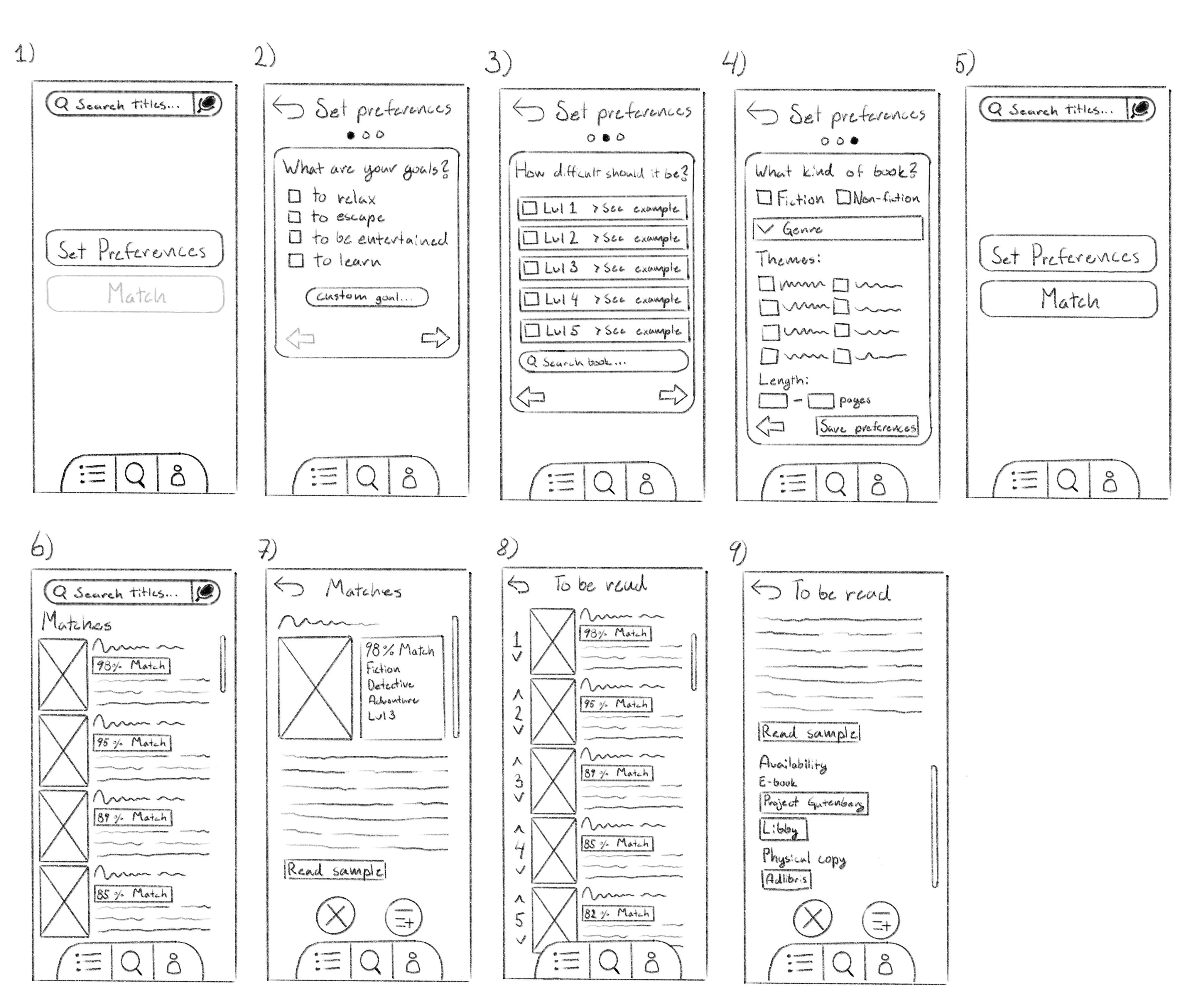
The following are the steps displayed in the sketches above (1-9):
- Sara opens the app, sees the start screen, and clicks "Set Preferences" to begin.
- She selects her reading goal: to relax and be entertained.
- She checks examples for difficulty levels, searches Emma to gauge its level, and chooses one slightly easier.
- She picks the type, genre, and themes she wants—classic romantic fiction and satire—then saves her preferences.
- Back at the start screen, the match button is now available, and she presses it.
- She views a list of matched books with ratings and selects the top-rated one.
- On the book's page, she reads the synopsis, compares its attributes to her preferences, and reviews sample pages. She adds it to her TBR list and moves to the next match.
- After adding a few books, she goes to her TBR list, reorders it, and picks the top book.
- On the book's details page, she scrolls down and sees it’s available for free on Project Gutenberg.
Expert Evaluations
As part of the human-computer interaction course, expert evaluations were conducted to analyze the initial sketches and prototypes of the Book Finder app. These evaluations, including heuristic analyses, hierarchical task analyses, and cognitive walkthroughs, were performed by peers and provided valuable insights into usability challenges and areas for improvement:
- Unclear Button Functionality: The "Reject" button's purpose was ambiguous, leading to confusion about whether it dismissed a match or simply navigated to the next option.
- Unfamiliar Terminology for "TBR List": The term "TBR List" (To Be Read) was identified as potentially unfamiliar to users outside niche reading communities.
- Unfamiliar Icon for Add to List Button: The icon for adding books to the TBR list was flagged as potentially unclear or unfamiliar to users.
- Lack of Exit Prompt: No warning or confirmation was provided when users attempted to exit the survey, increasing the likelihood of accidental errors.
- Unnecessary Steps: After completing the preference setup, users are required to return to the start screen to match books, adding unnecessary steps to the process.
These findings formed the basis for refining the app, ensuring it better addressed user needs while aligning with HCI principles.
Figma Prototype
After receiving the feedback, I started working on a prototype in Figma that addressed the possible usability problems that were uncovered.
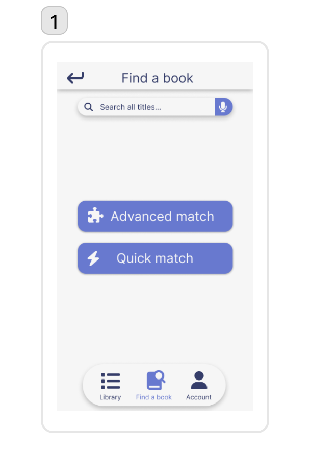
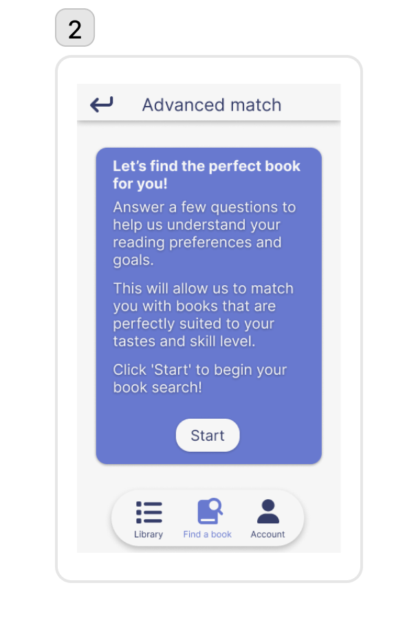
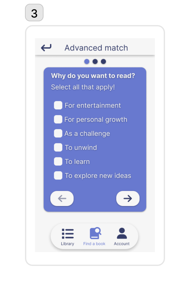

The following are the steps displayed in the prototype images above (1-9):
- To find a book Sara has two options, the “advanced match” or “quick match”. She wants something specific based on her current mood so she clicks “advanced match”.
- She reads about the advanced match feature and clicks “start” to continue.
- She selects her reading goal (to unwind and be entertained) and clicks the arrow button.
- She chooses the type (fiction), genres (romance and satire), and themes (emotional and funny), then clicks the arrow button again.
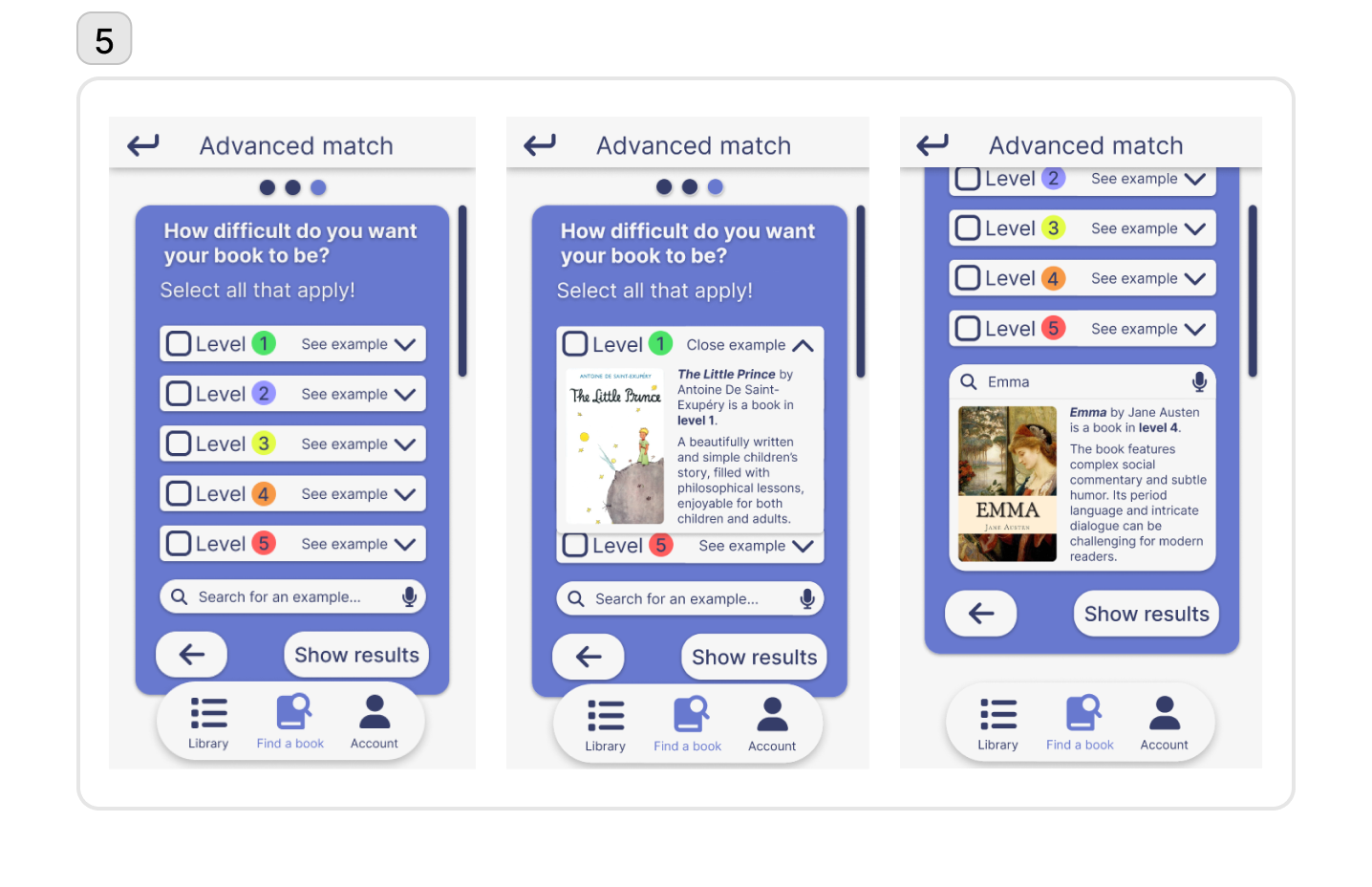
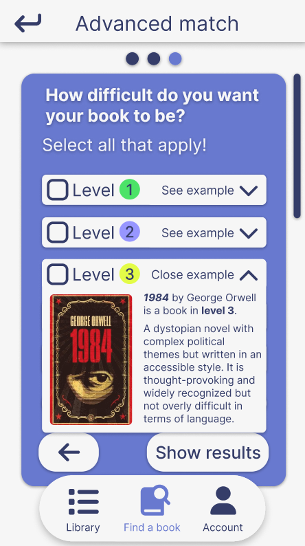
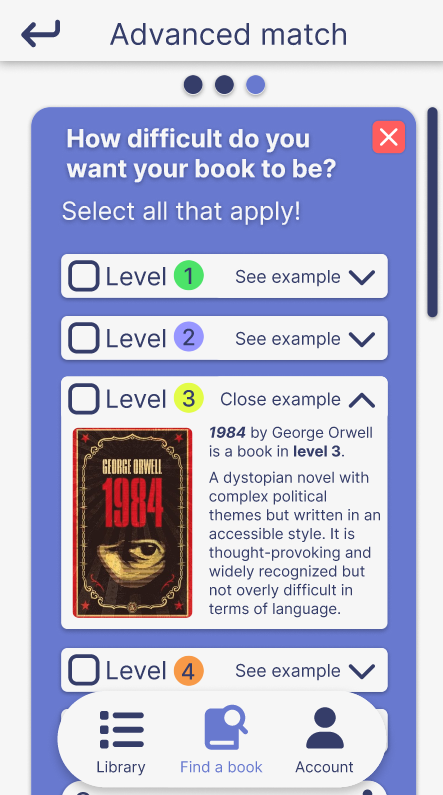
- She picks difficulty level 3 after checking examples and comparing it to Emma (level 4), then clicks “show results.”
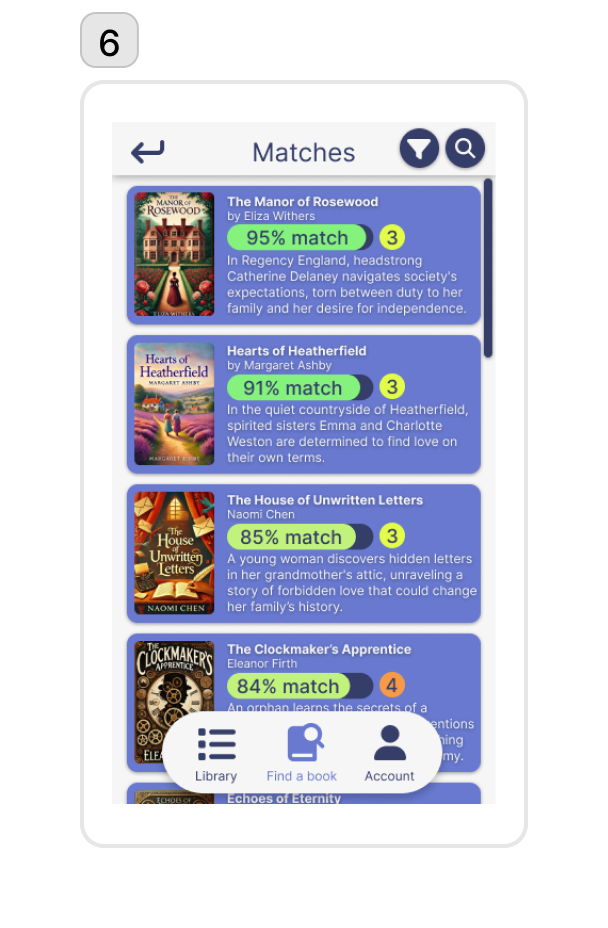
- A match list appears, and she clicks on the top result for more details.
- She reads the synopsis, checks match stats, and adds the book to her library. She repeats for another book and views her library.
- Sara selects the list “Advanced Match 1” and decides on the first book to read.
- She clicks “available at” and finds the book is free on Project Gutenberg as an e-book.
In the prototype, I addressed key usability challenges to improve clarity and efficiency. I replaced the ambiguous "Reject" button with a clear "Add to List" button that toggles to "Remove from List," alongside navigation arrows for easier browsing. The term "TBR List" was changed to "Library" for broader user understanding, and match list items were redesigned to look like clickable buttons, improving affordance. To prevent accidental survey exits, I added a warning prompt, and I streamlined the process by allowing users to match books directly after setting preferences, removing the need to return to the start screen. These changes simplify interactions, enhance usability, and reduce user confusion.
User Testing
The usability test was conducted with three participants aged 27–44, all avid readers. Two primarily read fiction, while one prefers non-fiction. One participant actively discusses books online, while the others share their thoughts within personal circles. On average, participants read two books per month. The tests were conducted in two formats: two participants performed the test remotely via Discord with screen sharing, while the third test was conducted in person. During all tests, participants received instructions before proceeding, and notes were taken to capture strengths and weaknesses for analysis.
Possible usability issues:
- Obscuring Dropdown Buttons: The dropdown buttons in the questionnaire (step 4 and 5) obscured other elements on the screen, including the "next" button, as some participants left them open.
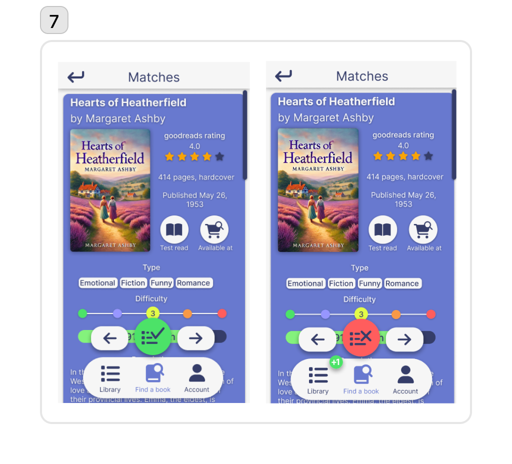
- Cluttered Book Suggestion Screen: The book suggestion screen felt cluttered due to the sudden appearance of large action buttons (as seen in step 7), which gave participants a sense of losing control.
- Navigational Confusion: The presence of two "go back" buttons during the questionnaire (step 2-5) caused navigation confusion, particularly when the upper back button prompted an exit confirmation instead of returning to the previous page.
Final Design
The final design attempted to address the possible usability issues identified from the user tests. The full final design can be viewed in the video at the beginning of this case study.
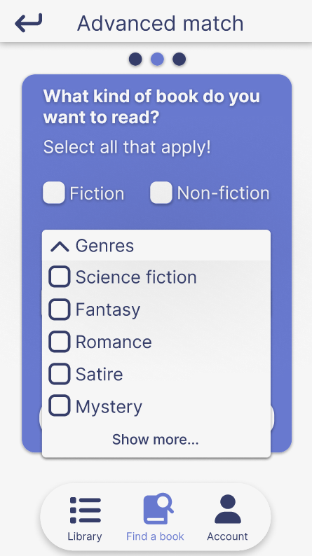
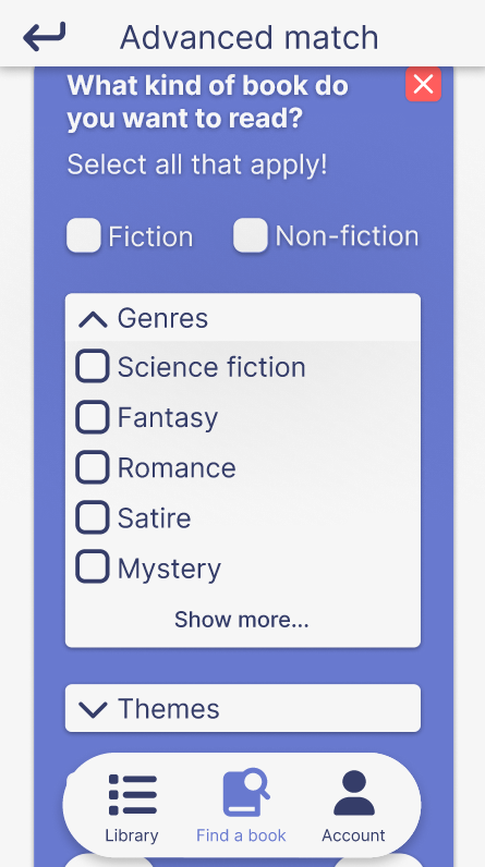
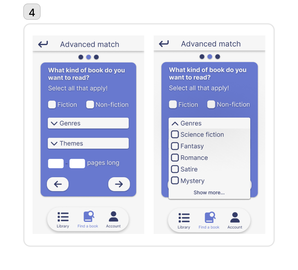
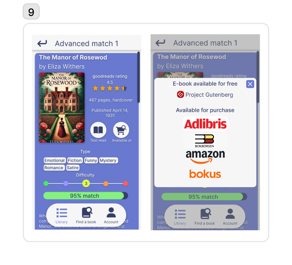
The images above illustrate the "before" and "after" states of two steps in the advanced match survey. On the left, the dropdown buttons in their original design are shown.
To address the previously mentioned issue of drop down lists obscuring information and controls on the page (as seen in the pictures above on the left), the design was updated so the dropdowns expand without covering any content (as seen in the images on the right).
The other issue of the difficult navigation was also addressed. To exit the survey, a common cross button in the right hand corner was added. The back button on the upper left hand corner now works in the same manner as the back button on the survey in the bottom left hand corner with one exception: the back button on the survey can only be until the last page of the survey, while the other back button can be used until the home menu.
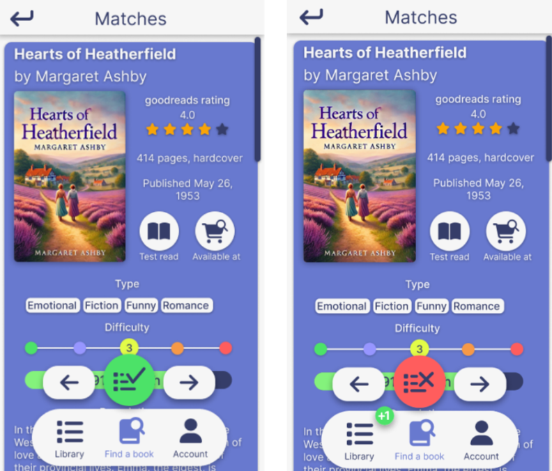
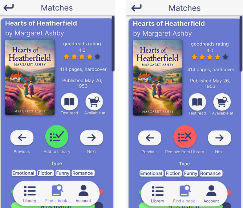
The cluttered book suggestion screen can be seen in left image above, while the final design can bee seen on the right. Here, the list navigation buttons and the "Add to Library" button where integrated into the suggestion page instead of hovering above the page in a fixed position. In this way, it does not cover any information while scrolling the book's page.
Concluding Remarks
The Book Finder project provided a valuable opportunity to explore user-centered design principles and address a real-world challenge: helping readers find books that align with their skills, interests, and goals. Through a combination of user research, iterative prototyping, and expert evaluations, the final design achieved its goal of creating a personalized, accessible, and intuitive book recommendation tool.
Future Improvements
A multitude of future improvements are possible. For one, not all of the features of the app has been designed. The current design clearly implies the use of an account, as well as the second search option "Quick match". The idea was that the user could save book they have read, maybe import from other sites such as Goodreads, and that Quick match would give a fast recommendation based on the user's reading history. This would be an avenue in for AI-powered recommendations. Future iterrations could also focus on more diverse accessibility features (e.g., text-to-speech or high-contrast modes), and larger-scale user testing to validate the app's effectiveness across different demographics.
Final Thoughts
This project not only strengthened my understanding of HCI principles but also reinforced the importance of empathetic, user-focused design. By addressing real user challenges and iteratively improving the design, Book Finder demonstrates the potential for technology to create meaningful, impactful experiences for its users.