Infotainment User-Interface Design
This project was a collaborative assignment for the course ‘Cognitive Design’ at the Umeå Institute of Design (UID). The project was called ‘Me and my car’ and the goal was to design an infotainment system for a car that integrates cognitive ergonomic principles and research to make the use of the interface as safe as possible.
The Assignment
An infotainment system is a system that combines information and entertainment. In a car it is mostly located in the center stack and often offers navigation, radio, telephone, climate control, and more. For this project, we were given four areas of focus—two obligatory and two voluntary. The areas were:
- 1. A start screen with a main menu and a radio/music interface (obligatory)
- 2. A navigation interface (obligatory).
- 3. Telephone interface (voluntary).
- 4. Climate control (voluntary).
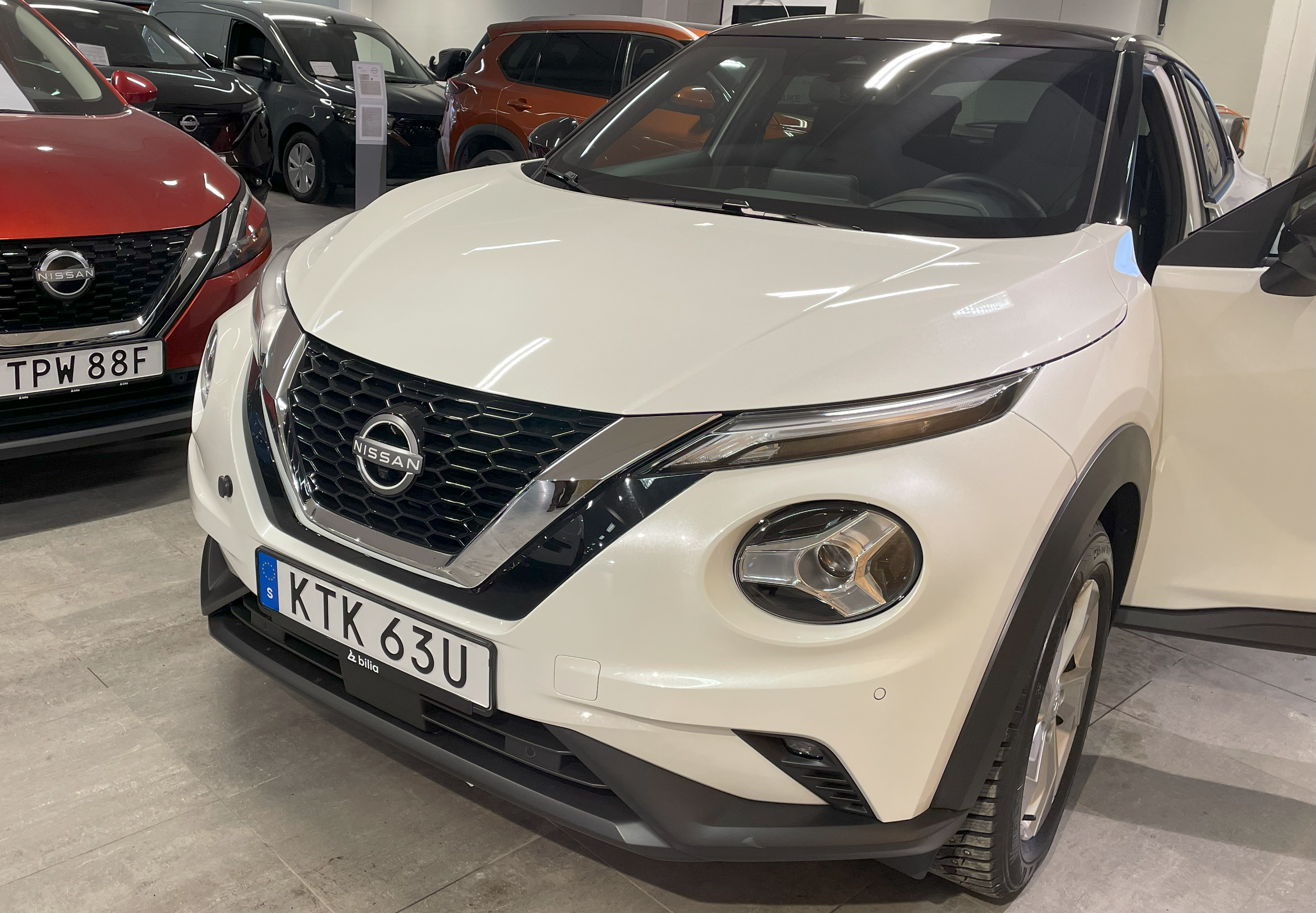
My team chose to focus on 1, 2, and 4. The different teams were also allocated a different car. My team was supposed to design an interface for the Nissan Juke.
Foundational Research: Interviews and User Tests
Our process started with an interview and a user test of the Nissan Juke with a salesperson at a car vendor. This let us get insight into how the car’s current infotainment system worked, what the salesperson sees as the selling points of the car, as well as the car’s market. After the interview and user test with the salesperson at the car vendor, the team conducted two user tests in other cars with other participants.
"Physical buttons are great since it makes it easier for the driver to find the buttons while focusing on the road. Everybody recognizes rotary knobs."
"I like that the digital interface is free of frills."
Insights from Salesperson
- A (relatively) simple touch-based interface in combination with physical buttons ensures usability.
- The Nissan Juke is mostly used as a secondary vehicle, where simplicity and accessibility is highly valued.
Insights from Other Car Users
- The tactile features of physical buttons makes the buttons easily located without taking one's eyes off the road.
- Physical buttons were also favored as ways of navigating between navigation, radio/music, and climate control interfaces.
- One user finds connecting to Bluetooth difficult, so they use the phone speaker when speaking with someone on the phone instead.
Secondary Research
At this stage of the design process, I looked for academic research on infotainment systems to get a grasp on cognitive demand in automotive environments. Some of the insights include:
- Square buttons reduce interaction time (Jung et al., 2021).
- Interaction times vary by task type (Strayer et al., 2017):
- Radio/music tasks have the shortest interaction time.
- Telephone tasks have moderate interaction time.
- Navigation tasks have the longest interaction time.
- Navigation tasks have the highest cognitive load.
- Reducing cognitive demand doesn't always enhance attention allocation (Oppenheim & Shinar, 2011):
- Too low cognitive demand can lead to distractions (e.g., texting or phone calls).
- This may decrease attention to driving.
These insights informed our user interface design to enhance usability and safety.
The Design Process
After the foundational research it was time to start working on the infotainment interface. We started by conducting a functional analysis of the different systems, elucidating the system requirements along its functions.
After synthesizing our research findings and insights, we entered the ideation phase where each team member contributed our own sketches. These initial concepts were then refined into low-fidelity prototypes to be tested for usability and functionality.
Low-Fidelity Prototype
At this stage we split up, sketched on our own ideas for the different interfaces, and then made three different low-fidelity prototypes that each could be tested by users.
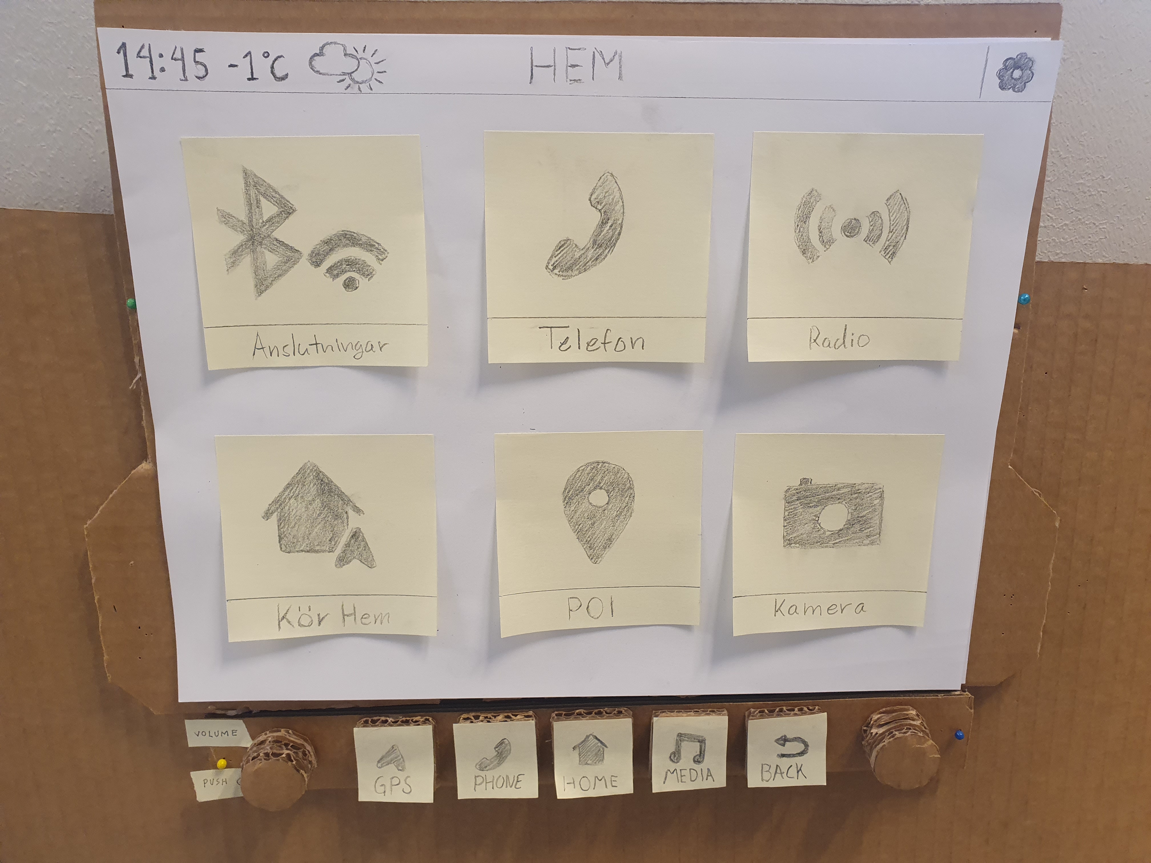
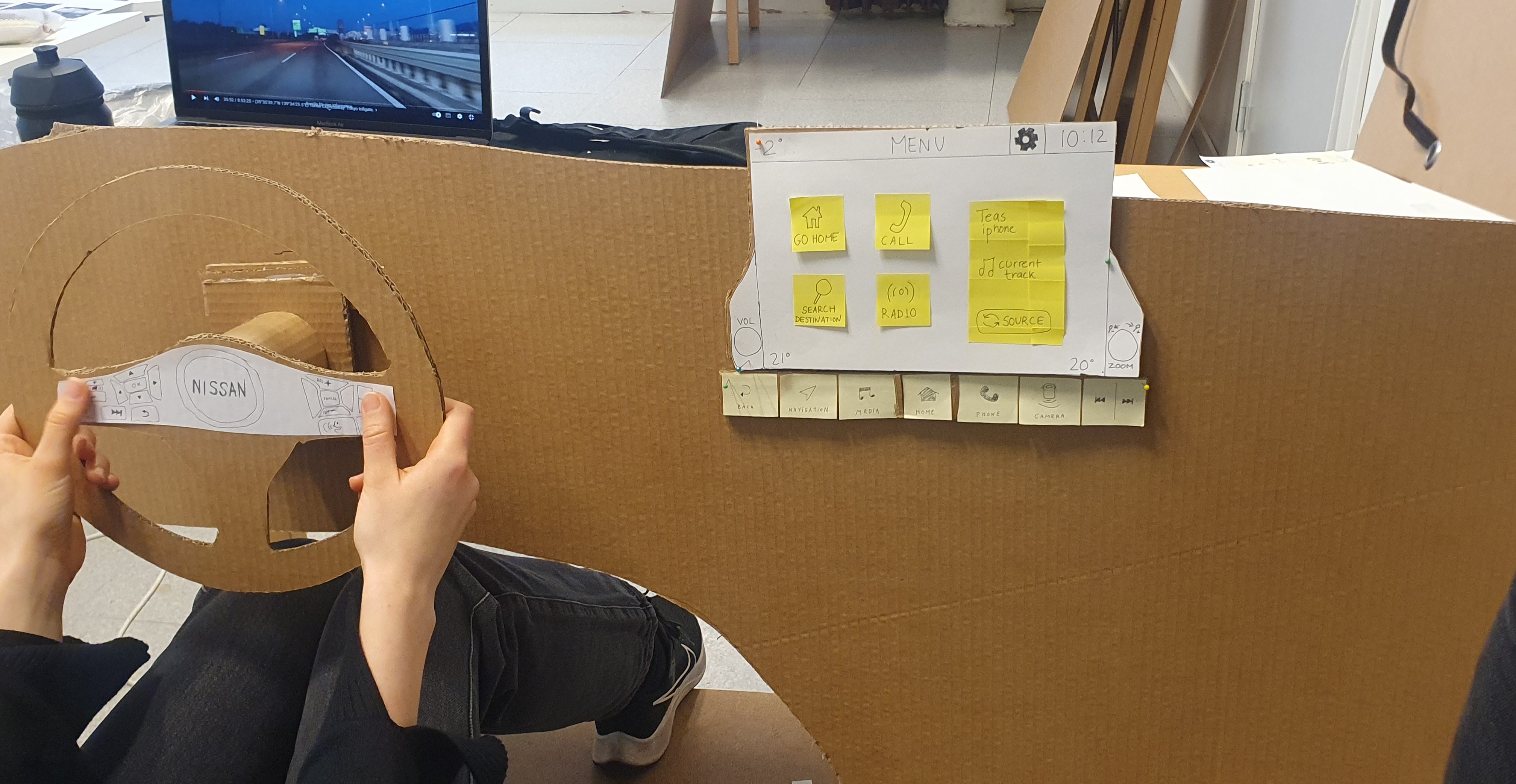
Above you can see my own low-fidelity prototype based on my sketches along with the low-fidelity prototype. The prototype consisted of an old car seat, with a computer screen in front playing a driving POV video to simulate driving. The third picture was taken during a user test with one of my teammate’s home menu interface.
Based on these user tests conducted on three participants, we started integrating our designs into one single design based on which aspects the users preferred.
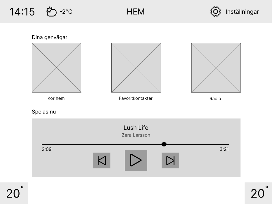
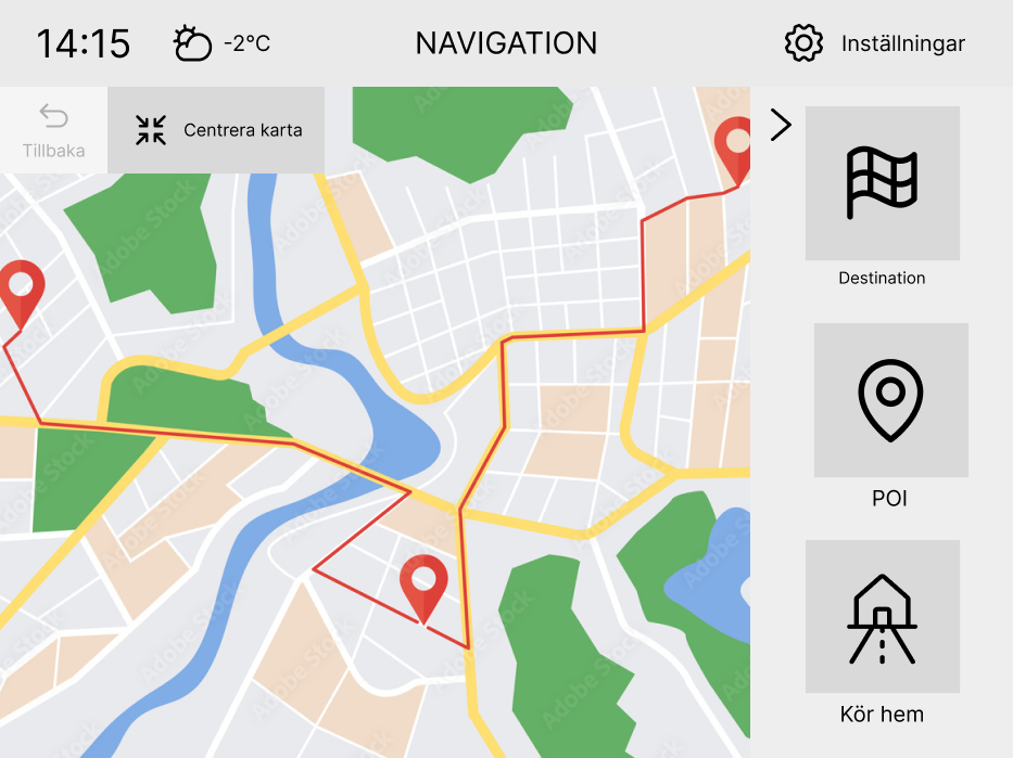
Above you can see three wire frames of the integrated design created in Figma. The first wire frame was based on my prototype of the home menu with a integrated media widget from a teammate's low-fidelity prototype; the latter two wireframes were created by me and entirely based on my low-fidelity prototypes.
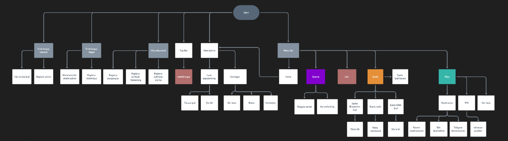
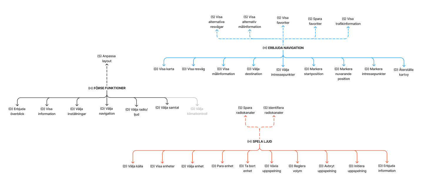
When creating the wireframes, we got an idea of how we wanted our design to look like, what page structure it would have and the user flow, which was visualized as a flow chart (in Swedish) that can be seen above. It is a somewhat shallow system—that is, the user will not get lost in a jungle of menus within menus. We deemed this to be an important aspect of our system, so that the user does not spend too much time navigating the infotainment system.
High-Fidelity Prototype
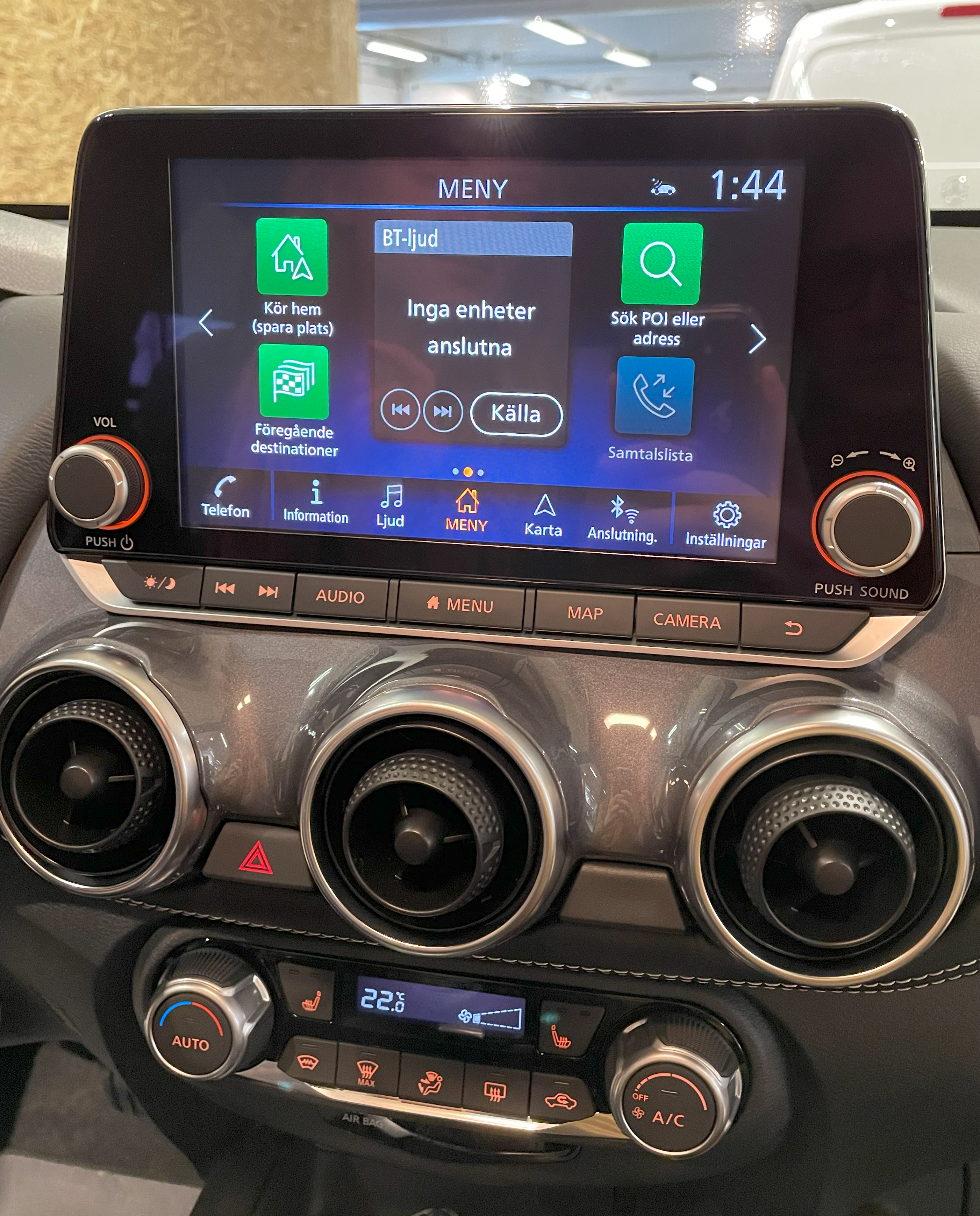
After the low-fidelity prototype had been created, we started on the high-fidelity, clickable prototype in Figma. Through iterative testing in real car settings, we fine-tuned the interface for optimal usability, addressing user feedback to enhance button visibility, navigation clarity, and tactile feedback on physical controls.
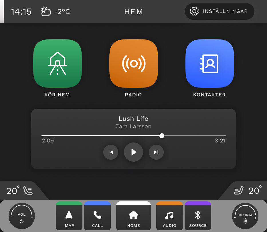
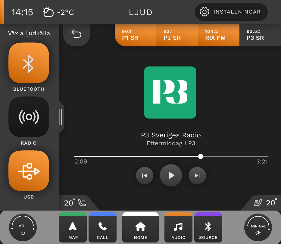
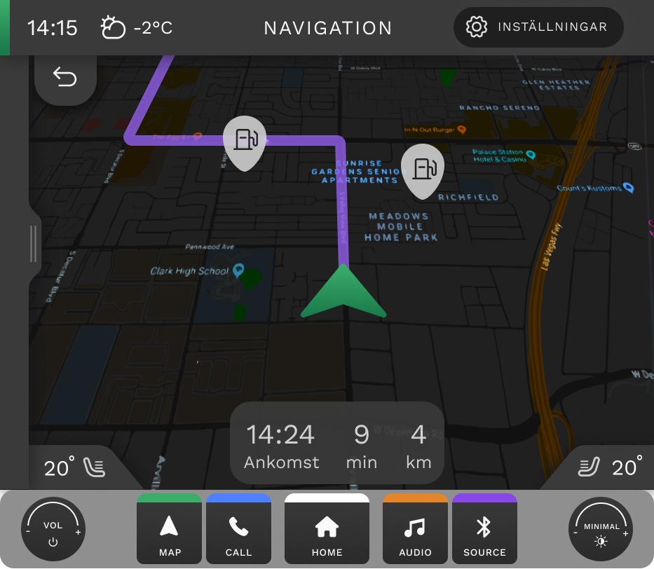
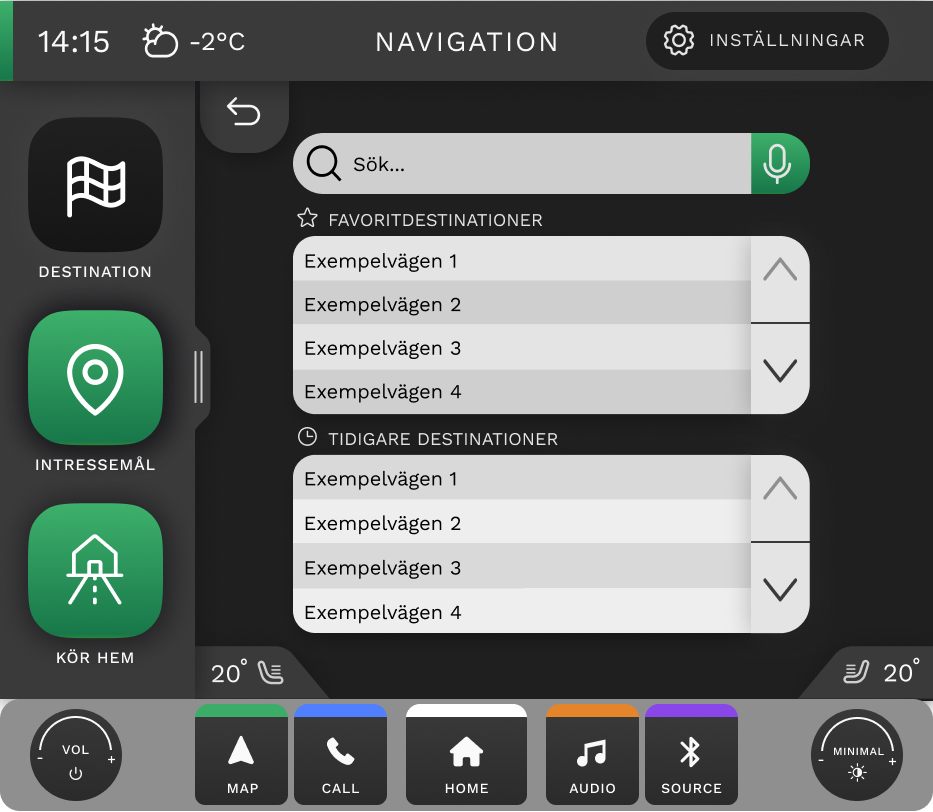
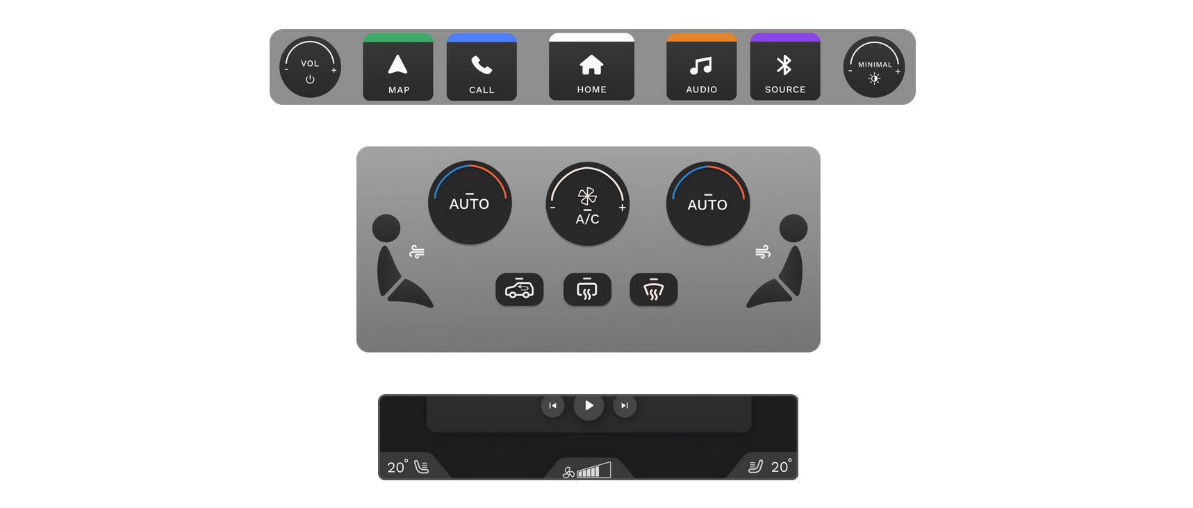
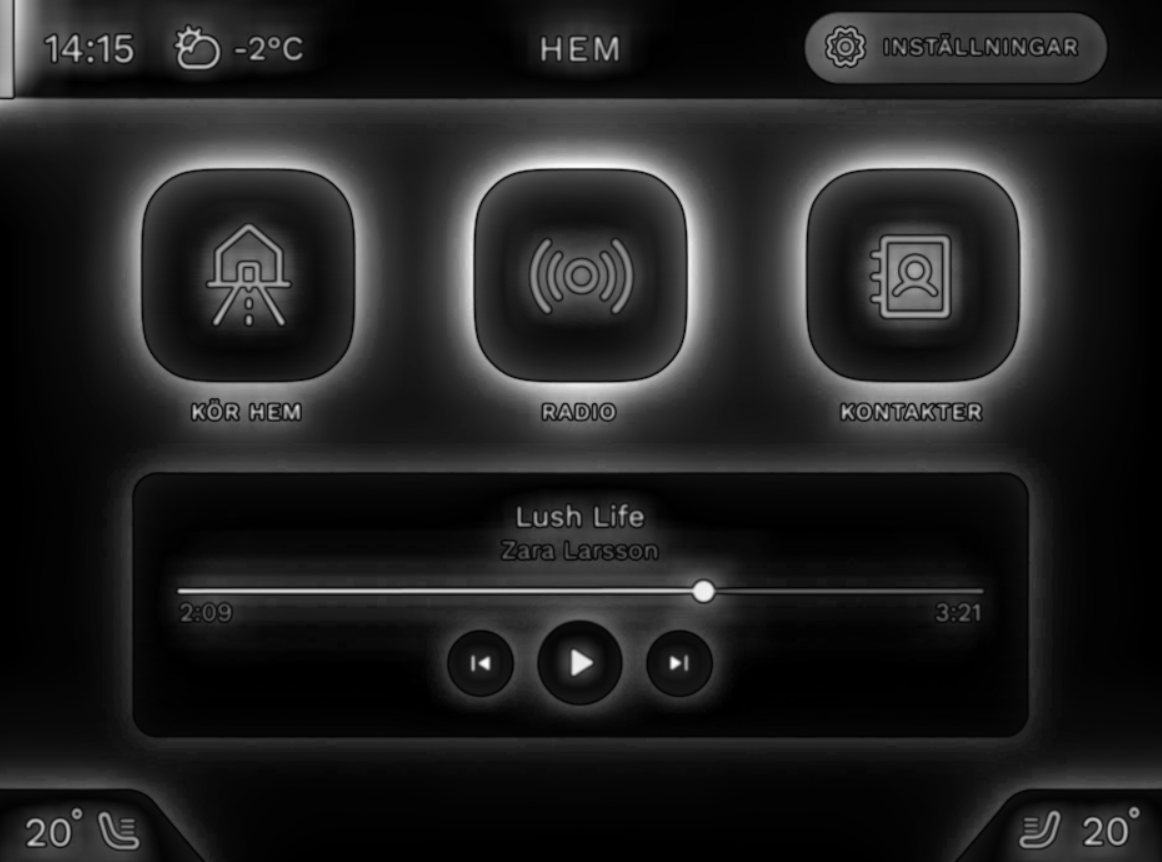
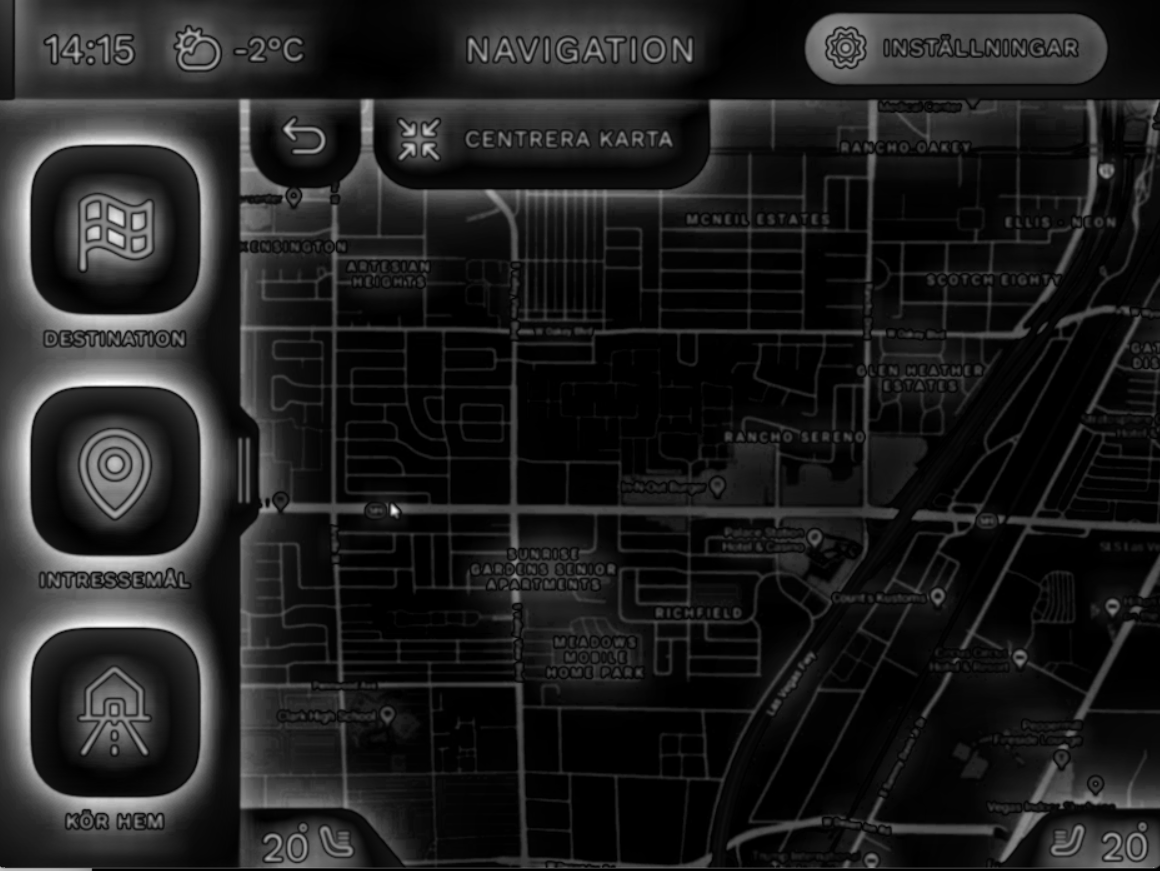
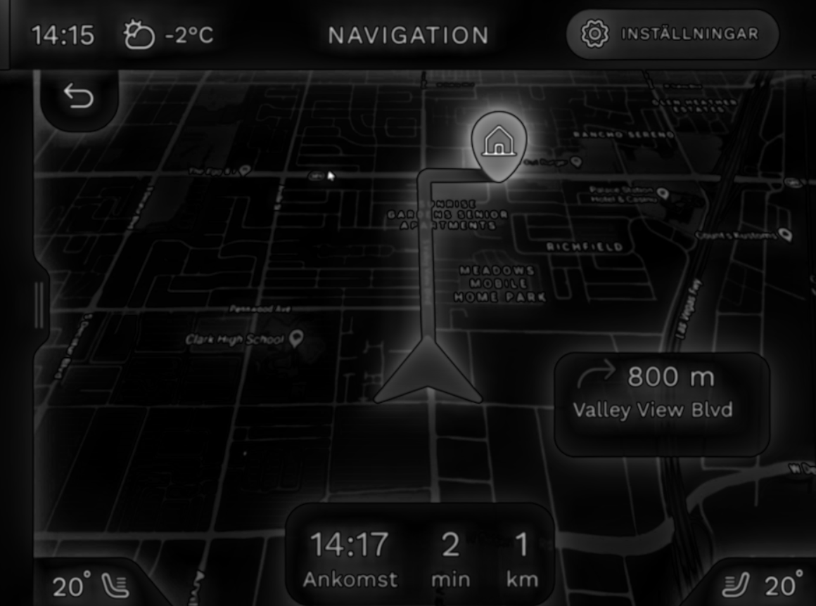
Above you can see some of the screens of the prototype. There is a bar of buttons for each main function at the bottom of the screen, along with a source button, volume rotary knob, and screen light rotary knob. The climate control bar below triggers a feedback popup on the screen. These elements were designed in Figma along with the touch interface but represent physical buttons.
An idea we had early on, which persisted throughout the project, was to color-code the different pages in the interface for easy identification. The sub-interfaces (navigation, audio, home, etc) are color coded so that the same color scheme was used for shortcuts related to each page along with the physical menu buttons.
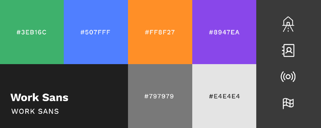
The system primarily uses a dark mode color scheme, aligning with industry standards to create a calm environment and minimize driver distraction. Bold colors like green, orange, and blue are incorporated to provide clear visual cues, helping drivers quickly locate key functions such as accessing the radio or selecting ‘drive home.’
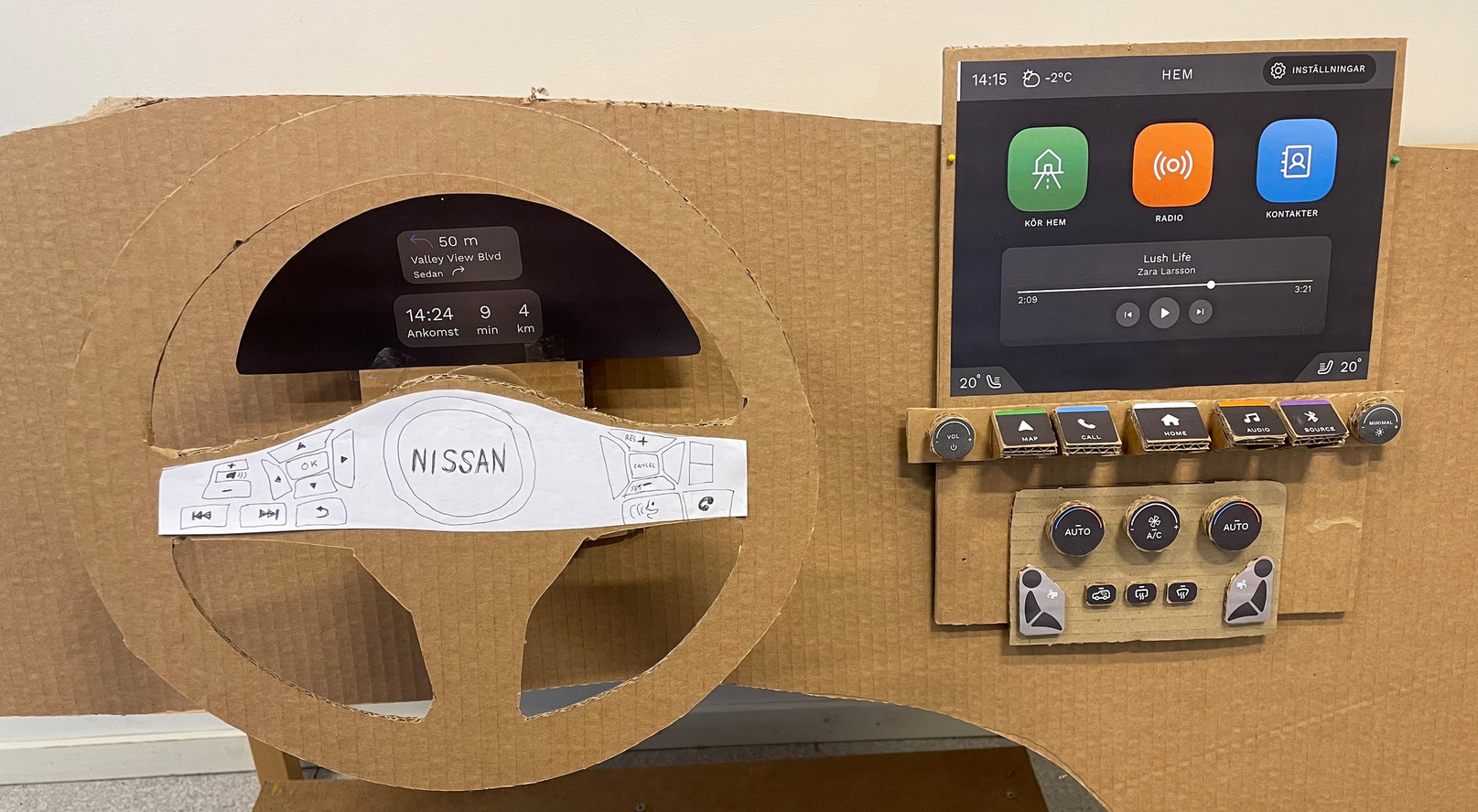
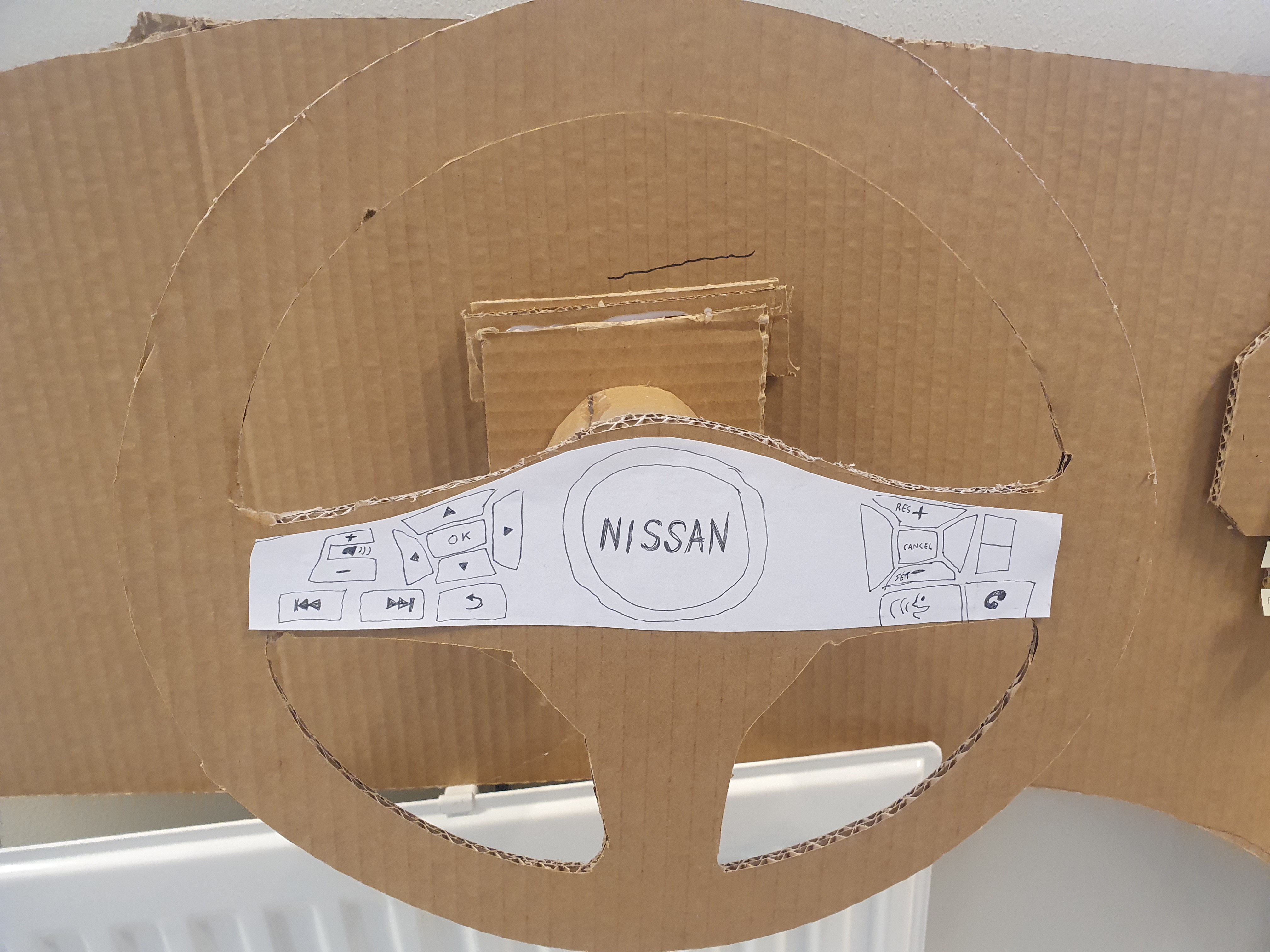
The overview shows the system layout, including the touchscreen, menu bar, and climate control. The 'home menu' button is centered, with other buttons grouped in pairs for tactile guidance. Knobs are kept for easy volume and temperature adjustments. Navigation info is displayed behind the steering wheel, which also has arrow keys for an alternative way to navigate the infotainment system, useful in situations like cold winter mornings as emphasized by the foundational research.
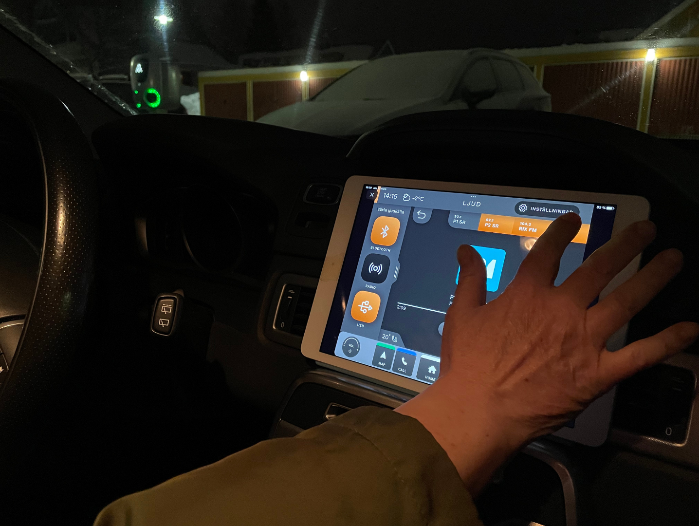
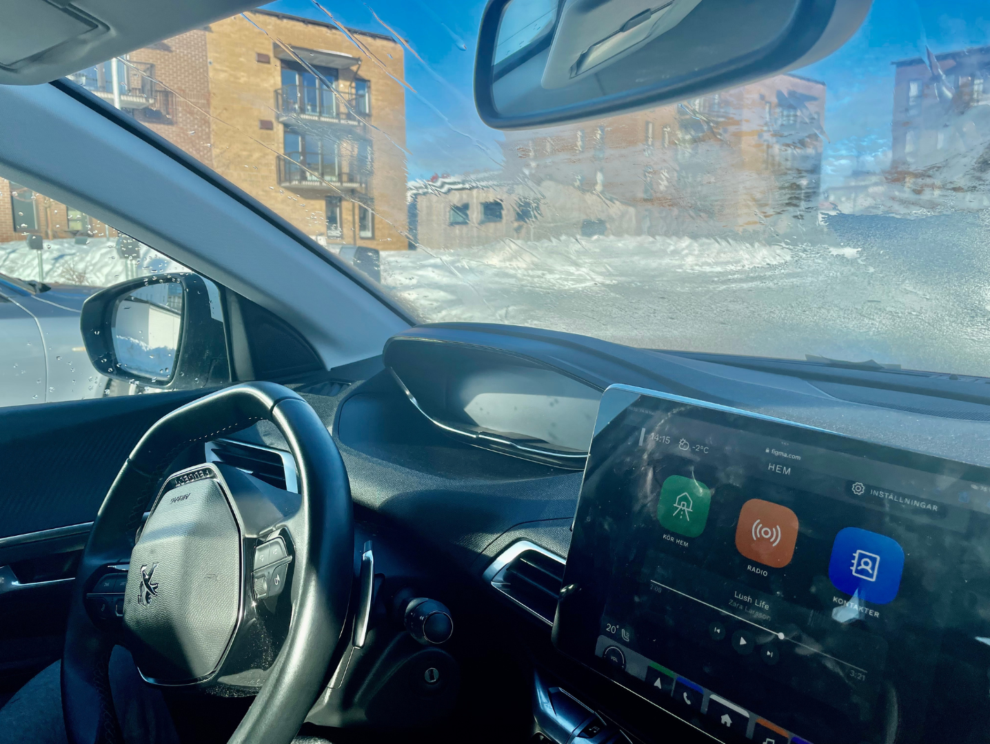
User Tests With the High-Fidelity Prototype
We conducted the final round of user tests using a clickable prototype on an iPad inside a real car. During the two tests, participants viewed the startup screen for around 7 seconds and recalled what stood out. They then explored the screen further and provided feedback. Participants were asked to perform specific tasks, such as changing the radio channel or entering a navigation destination, while thinking aloud.
After completing these tasks, they shared their feedback and discussed potential improvements:
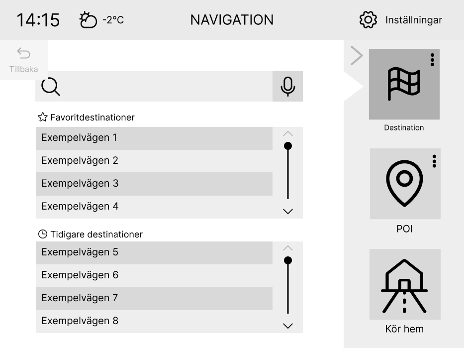
- The name for the 'POI' feature was changed to 'Intressemål' which means 'interest areas' in Swedish. This was more understandable to users than the unfamiliar acronym 'POI'.
- The search box was redesigned with a standard search icon and placeholder text to improve familiarity.
One participant felt that the current concept of dimming the current/selected button gave the impression that it was inactive rather than selected. This led to discussions within the group, and alternative solutions were considered and tested, but ultimately, the original version was retained.
The Cognitive Aspects of the Design
The cognitive aspects of the design focused on ensuring that the infotainment system is intuitive and minimizes driver distraction. By analyzing visual attention patterns and optimizing button sizes and placement, the design aims to enhance usability and safety, keeping the driver’s focus on the road.
Analyzing Visual Angles
To gauge the perceived size of the icons and optimize its size to be easily identifiable in the periphery, we calculated the visual angle of the touch buttons. Following design guidelines, we aimed to achieve at least 1.43 degrees (Campbell et al., 2007).
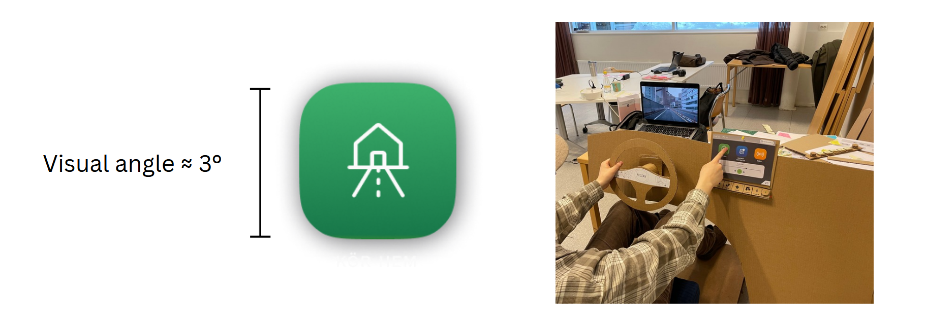
Our buttons measured approximately 3 degrees (3.27 degrees for the leftmost icon and 3.03 degrees for the rightmost icon in the above image). Therefore, we were able to reduce the size while still adhering to the guidelines. However, we wanted the buttons to be identifiable in the periphery and determined through self-testing that larger buttons were most suitable.
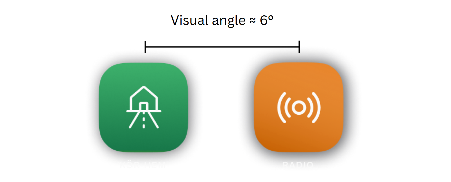
The distance between button centers should be twice their visual angle to avoid crowding, which means 6 degrees for our 3-degree buttons. Initially, the buttons were 5.8 degrees apart, so adjustments were needed. We didn't follow this guideline for the side menu but kept a larger clickable area to make buttons easier to spot and hit in the periphery while watching the road.
Creating Saliency Maps with AI
Next, I was tasked with creating saliency maps to visualize the most attention-grabbing elements of the interface. I utilized OpenCV’s machine learning saliency module in Python to create the maps.
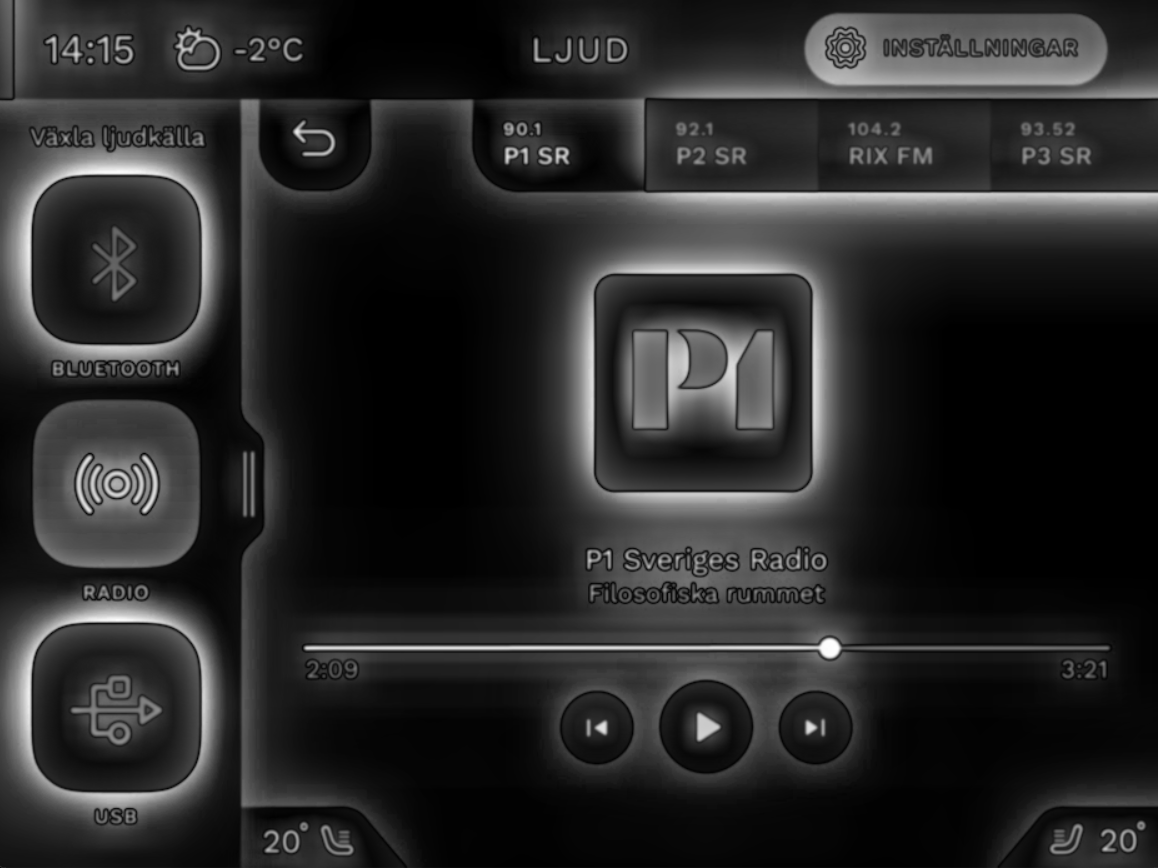
The saliency maps can be seen above, and as planned, the shortcuts are the most prominent elements in the main menu and the navigation’s base mode. Once a destination is set, the route and destination become prominent. The radio screen contains many elements that attract attention, but this can be reduced by collapsing the side menu.
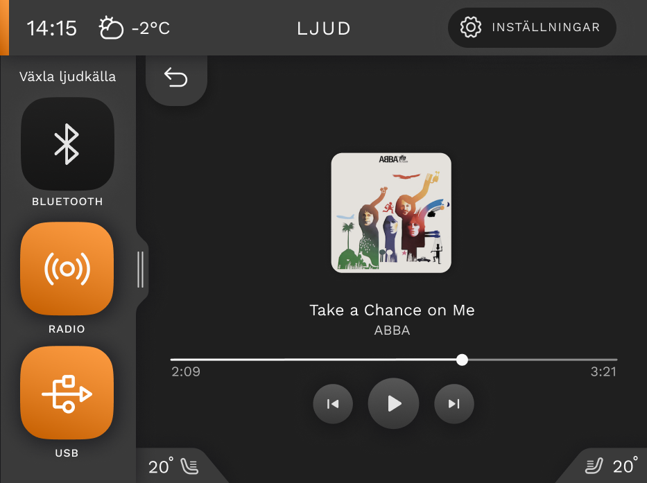
In the pictures above we can see the reasons for keeping the currently selected/active button dimmed. When a participant is searching for the next button to click, they will not be distracted by more clutter on the screen as evidenced by the decreased saliency of the bluetooth button in the above image. This was the reason why we decided to go against the participant's comment.
Designing for Sensory Cue Integration
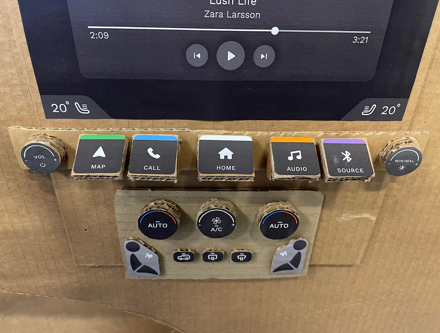
A cognitive-based design decision was to include physical controls for better sensory cue integration. Physical buttons were recommended by the car dealer, particularly for the target audience who use the Nissan Juke as a secondary vehicle, where simple, accessible buttons are crucial. This design allows users to feel their way to buttons, keeping their eyes on the road. Buttons are grouped for easy localization, and prominent icons on the menu bar provide additional tactile cues. Different sizes, shapes, and groupings were used to clarify functions: the top row for menu buttons, and the cluster below for climate control.
Concluding Remarks
The development of the infotainment user interface for the Nissan Juke focused on safety and usability by integrating cognitive ergonomic principles and user feedback. Our design approach was informed by both user research and professional recommendations.
Key highlights of the project include:
- Physical Controls: Integration of tactile buttons for easy operation without diverting attention from the road.
- Simplicity and Accessibility: A user-friendly interface with clear visual cues and intuitive navigation, ideal for secondary vehicle users.
- Iterative Testing: Continuous refinement through low-fidelity and high-fidelity prototypes, ensuring the design met user needs.
- Cognitive Design: Utilized saliency maps to analyze elements that capture user attention and optimized button sizes and spacing through visual angle measurement to enhance visibility and accessibility, reducing cognitive load while driving.
The final design effectively combines digital and physical elements, offering a safe, intuitive infotainment experience tailored to the needs of Nissan Juke drivers.
References
Campbell, J. L., Richard, C. M., Brown, J. L., & McCallum, M. (2007). Crash warning system interfaces: Human factors insights and lessons learned. NHTSA.
Jung, S., Park, J., Park, J., Choe, M., Kim, T., Choi, M., & Lee, S. (2021). Effect of touch button interface on In-Vehicle Information Systems usability. International Journal of Human-computer Interaction, 37(15), 1404–1422. https://doi.org/10.1080/10447318.2021.1886484
Oppenheim, I., & Shinar, D. (2011). Human Factors and Ergonomics. In Handbook of Traffic Psychology (pp. 193-211). Elsevier. https://doi.org/10.1016/B978-0-12-381984-0.10015-3
Strayer, D. L., Cooper, J. M., McCarty, M. M., Getty, D. J., Wheatley, C. L., Motzkus, C. J., Goethe, R. M., Biondi, F., & Horrey, W. J. (2019). Visual and cognitive demands of CarPlay, Android Auto, and five native infotainment systems. Human Factors, 61(8), 1371–1386. https://doi.org/10.1177/0018720819836575